Emmys: a Red Carpet Rehash
So, the Emmys happened! I don’t care who won. I came for the dresses.
The good, the bad, and the ugly!
THE GOOD:
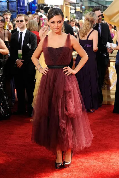
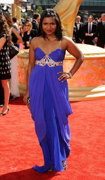
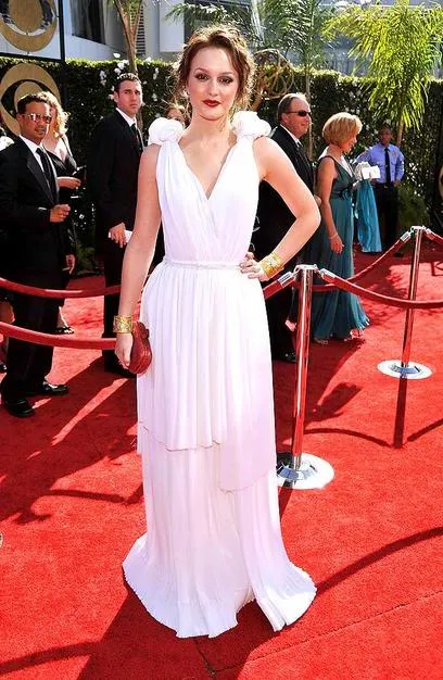
Best look of the night, if you ask me. This is how you rock loose, floaty layers that are slightly out of proportion:
I loved this.
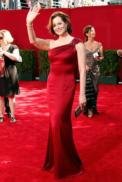
Dame Sigourney Weaver, being awesomer than everyone.
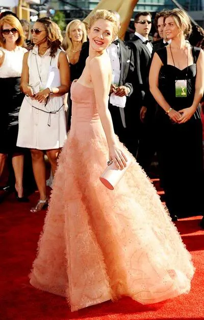
This is almost too sweet, but it’s Drew Barrymore. Sure, she can’t really act, but she’s so genuinely charming that this halo isn’t even a trick of the light; the sun shines a little brighter, just for her.
This would be amazing if it wasn’t for the mantilla out the back.
The year: 1922. This dress: awesome then, awesome now.
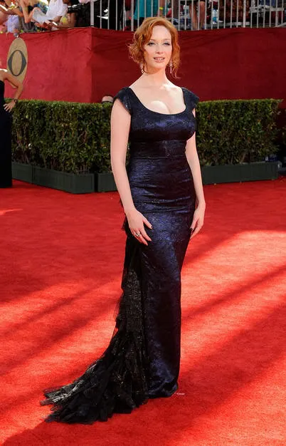
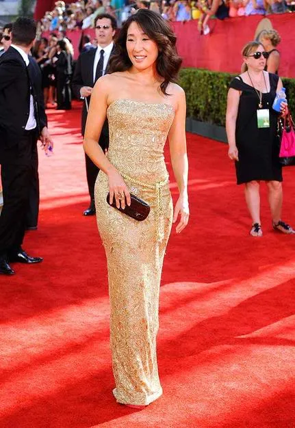
This is so simple that it would be plain, except that the texture is really rich without looking like upholstery. Thumbs up.
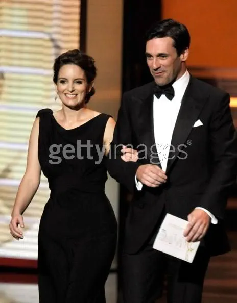
She’s stunning. He looks like a cartoon pilot.
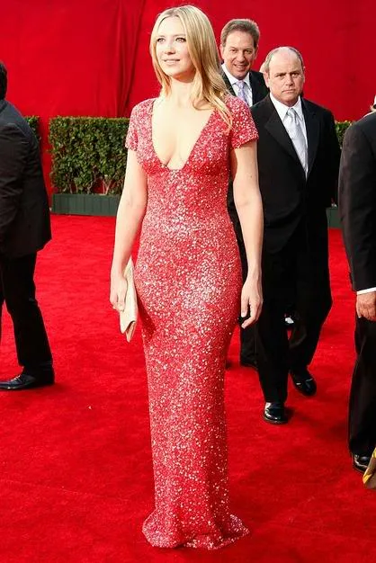
Anna Torv. A little too much cleavage (the bodice pieces should meet where the skirt starts or the proportions look off), but it’s nice to see short sleeves that look glamorous.
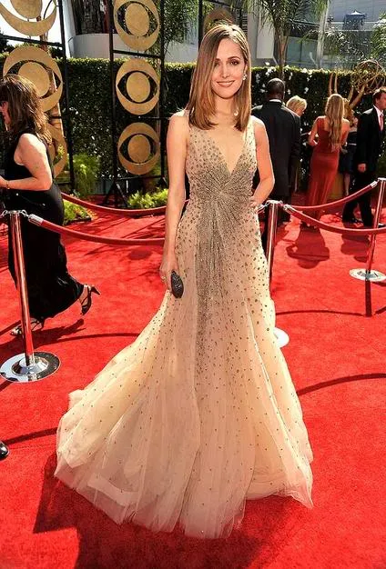
Rose Byrne. Nude without looking naked, sparkles without looking like a pageant contestant, tulle without looking bridal. (And my one bodysnark of the night: she’s looking really, really thin. Hollywood is cruel.)
I even liked this dress, though I don’t like the actress wearing it. It’s a nice use of layers to add interest without being too floaty:

It works, even though it sort of looks like a topographical map or a medical problem.
SPEAKING OF MEDICAL PROBLEMS:
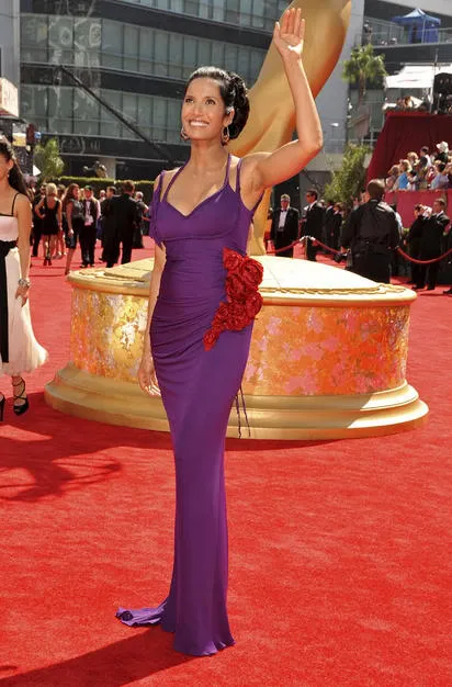
An enormous parasite makes its move on Padma.

This dress is bleeding internally! MEDIC!
This dress reproduces by budding.
Those sutures are infected! MEDIC!
THE BAD. You guys, you were all SO CLOSE.
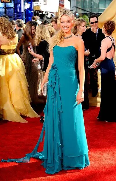
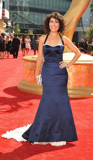
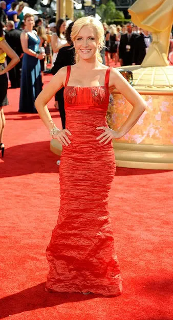
Love the idea! Too bad it looks like you’re trailing toilet paper.
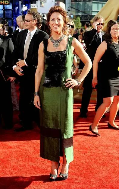
It’s her style, I guess, if we’re back in 1993. And the color is unusual without quite being dowdy. But man, the staggered band of color around the hem that looks like an accident, the eyelash fabric stapled to the top – honey, you can do better.
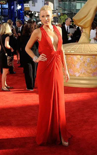
YES, THEY ARE VERY NICE, YOU CAN PUT THEM AWAY NOW, THANK YOU.
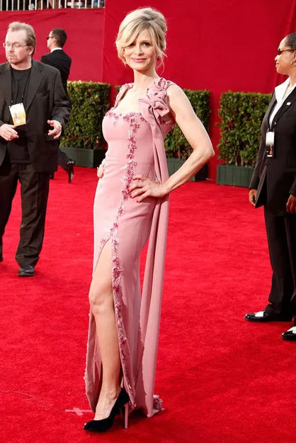
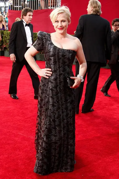
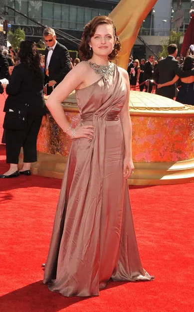
This is so close, except I’m not a fan of the one-shoulder, usually, but even then this might have worked except that I just feel like the puff is too much. If that had been a tight sleeve, I would have loved it. And the makeup and hair are awesome. Thumbs up.
This is how you DON’T rock floaty, too-big layers:
I love the color, love the idea. Just…didn’t quite get there.
Blair Waldorf should know that shoulder pads are SO 2008 Fall/Winter collections.
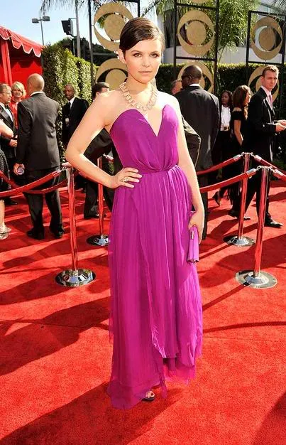
This would have worked without the necklace. (Don’t compete with a fancy neckline!) Also, one shade darker. Just one! The sunlight bounces off it and washes it out! You must know that, actresses! Think, damn you, think!
THE UGLY:

The human lampshade.
I don’t know why no one hemmed this. She looks like one of those huge inflatable Slinky-men they put outside the car dealers so they wave demonically in the wind.

No comment.
This is the face of a car salesman. You’ll never tell me any different.
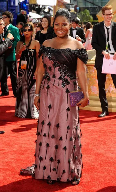
Where are those arrows even pointing?
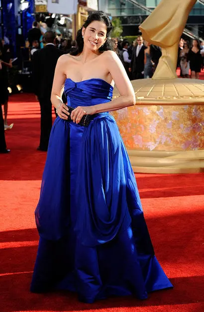
The deeply unfunny Sarah Silverman in a deeply ugly dress.
WHO IS LETTING CHRIS O’DONNEL ACT AGAIN? DID NO ONE SEE HIM IN THE THREE MUSKETEERS? IS THE WORLD NOTHING BUT A CRUEL JOKE?

